I wanted to create a dynamic logo where the simplicity was the key. Also, I want the logo to identified itself with the Latino culture. The upside-down or inverted exclamation marks are unique of Spanish language.
LOGO EVOLUTION
USAGE
To ensure that the viveArtU brand looks as professional and consistent as possible, please follow the rules and guidelines around usage detailed in this section
CLEAR SPACE
The logo needs to be surrounded by an area of uninterrupted clear space to allow legibility and prominence in all communications.
Clear space is the non-print area surrounding the logo. Wherever possible, apply more clear space than the minimum specified.


INCORRECT USE
The logo should only be used as described on previous sections.
These are some common incorrect usages we should try to avoid.
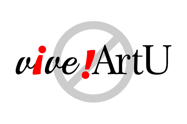
Don’t change the typeface
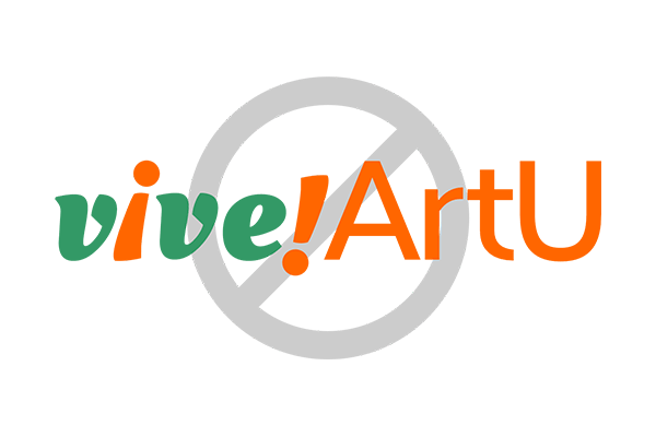
Don’t change the colors
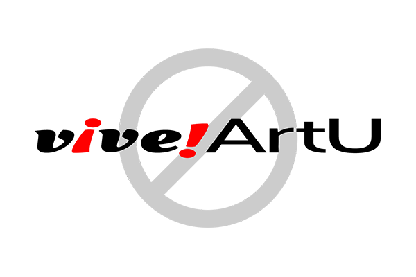
Don’t stretch, compress or skew

Don’t add any effects
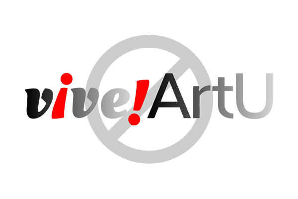
Don’t add any gradients

Don’t outline
MOTION GRAPHIC BUMPER

