Overview
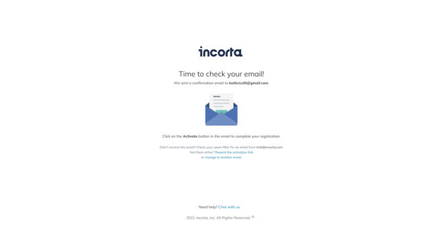
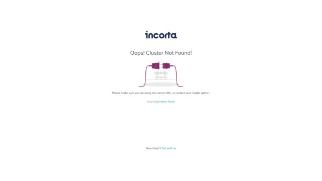
Our team revamped the error handling pages of the Incorta product by incorporating the new branding guidelines. By using the latest design trends and user experience best practices, we created a modern and user-friendly look and feel that improved the overall user experience, even in the event of errors.
Parameters
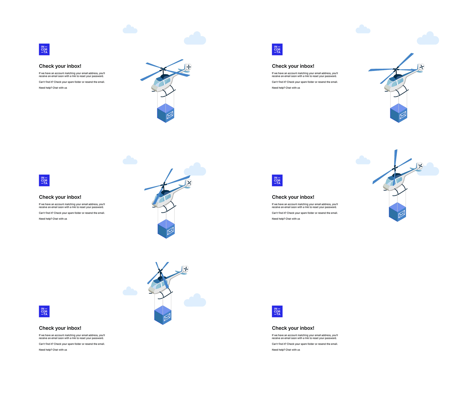
To ensure consistency in the error handling screen proposal, we edited the branding illustration by removing some elements. This allowed us to create a more cohesive graphic composition, aligning with the overall branding guidelines and enhancing the visual appeal and effectiveness of the error handling illustration.
Research
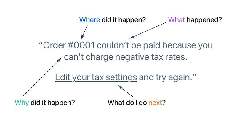
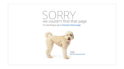
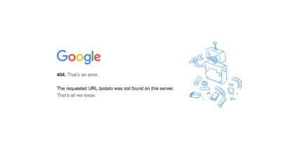
To create an effective error handling screen proposal, we researched current trends to define the tone, look and feel. By utilizing the latest design trends and user experience principles, we created a seamless and intuitive experience for users, aligning with the product’s visual identity and enhancing the user experience.
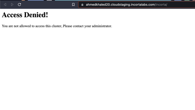
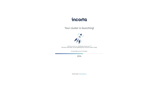
Current Error Handling Screens
Proposed Error Handling Screens
Our final error handling screen proposal included a motion graphic element and a humanized tone. The motion graphic added interactivity and engagement, while the tone created a more empathetic and relatable experience for users. This resulted in a compelling error handling screen that aligned with the product’s branding guidelines and user experience principles.

